In this post, we will see briefly how to perform downstream analysis for RNA-seq data.
BRB-seq libraries are no different than any other bulk RNA-seq libraries, so they can be analyzed with the same packages.
The only difference is that we can run all downstream analyses on the raw read count matrix, or the UMI-deduplicated count matrix.
It’s worth noting that in general, for bulk RNA-seq analysis, preprocessing does NOT include deduplication of the reads, even though duplication can be high (~50% for 30M reads TruSeq libraries for example).
Standard analysis pipelines are scripted in R or in Python. In this post we will mainly use R because it’s the accepted standard for RNA-seq analyses, but similar analyses and results can be obtained using Python. First, the data needs to be loaded from the file into the R environment, using base commands such as read.table, or more advanced (faster) ones, such as fread (from the data.table package).
Of note, here we use the tabulation as separator, and suppose that the count matrix has a header (with the sample names), and that the first column contains gene names (or identifiers).
Then we populate the row.names with the first column (which can be done in one line using the read.table function, but requires an extra effort for the data.table package).
Finally, we remove the first column containing the gene names. Of course, this is to be repeated if you need to load external metadata, for example for loading groups, covariates, or other phenotypes.
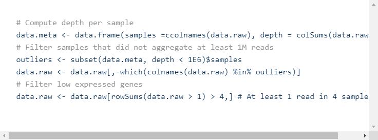
Once the data is loaded in R, the first step is usually to filter out the samples that did not aggregate enough reads, and the low expressed genes. There is not a standardized way to set the thresholds, so this step is very arbitrary. One could keep all genes that have at least one read across all samples or be more stringent.
Once the data is filtered, it should be normalized. In particular to remove the effect of sequencing depth and thus be able to compare the samples on a similar depth basis.
There are multiple normalization methods that can be used, such as CPM (counts per million), TPM (transcripts per million), RPKM (reads per kilobase per million), or more elaborated bulk RNA-seq methods such as limma voom, DESeq2 or edgeR.
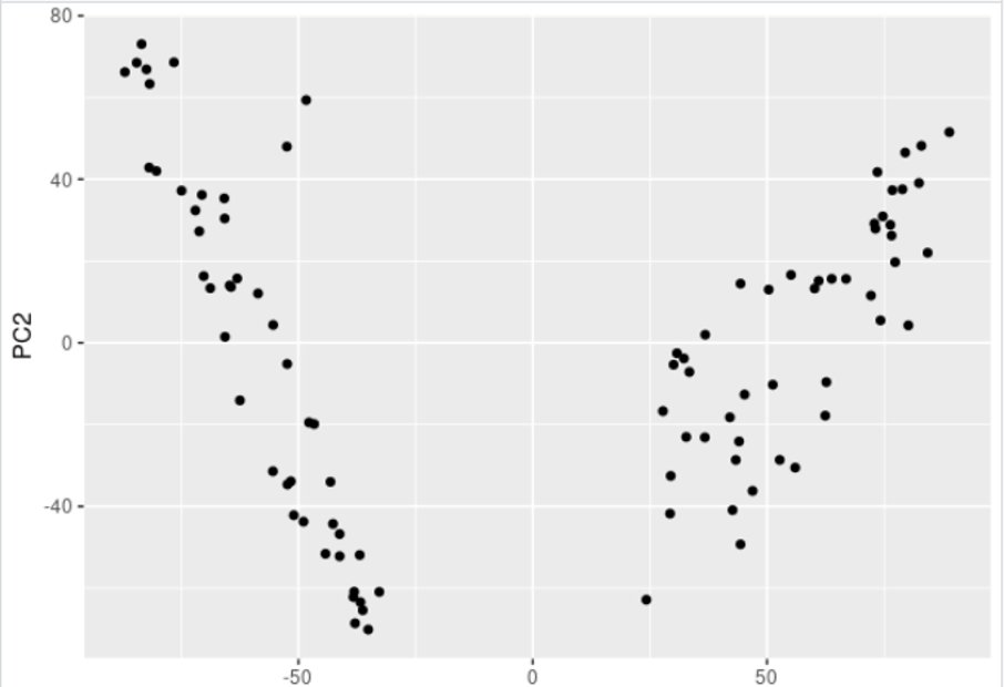
Then, at this stage, we usually want to visualize our data. We can do this using dimension reduction methods such as Principal Component Analysis (PCA) or MultiDimensional Scaling (MDS).
Of note, there are other of such methods initially tailored for single-cell RNA-seq, that can be of use for bulk RNA-seq, such as t-SNE or UMAP. It can then be plotted using the very nice ggplot2 library (here we don’t color the plot, but it can be colored and customized in many ways).
This will generate the following plot:
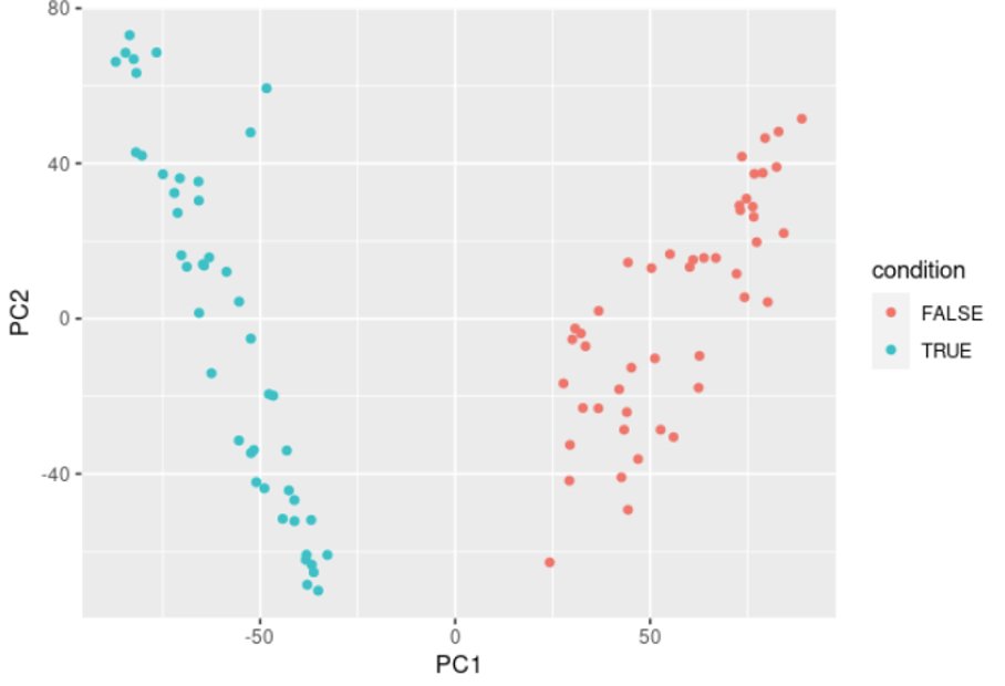
This plot should naturally split your samples into clusters corresponding to your biological conditions. It’s also a good QC to check for batch effect for example, if the data splits by batch.
Here it naturally splits into two groups, which correspond to the two conditions in our data.
This will generate the following plot:
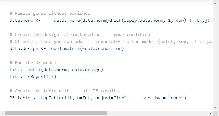
Now, the goal is often to find Differentially Expressed (DE) genes between your two conditions. Again, there are many methods for doing as such (limma, DESeq2, edgeR, …). We used limma-voom for normalizing, so that makes sense to run limma for DE.
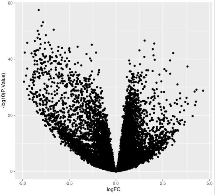
Once all stats are computed, you can visualize the results as a volcano plot.
This will generate the following plot:
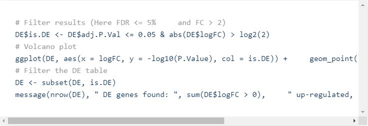
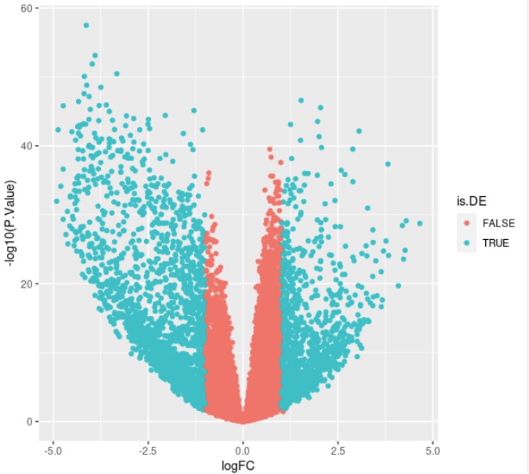
Now, we need to set some thresholds to select Differentially Expressed Genes (DEG). Usually, we set a threshold on the statistical significance (adjusted p-value, FDR) and one on the effect size of the change (fold-change).
Which messages something like: “3344 DE genes found: 1326 up-regulated, and 2018 down-regulated” and plots the following:
Of course, the sign of the fold-change depends on which group you took as “reference”, so the number of up- or down-regulated genes can be inverted if the reference group changes.
This can be verified by checking the rowMeans() expression of DE genes for each group of samples.
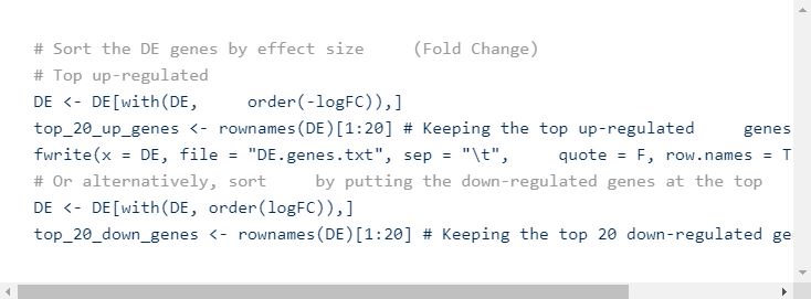
You can then sort the DE table and save it as an external text file using write.table or fwrite
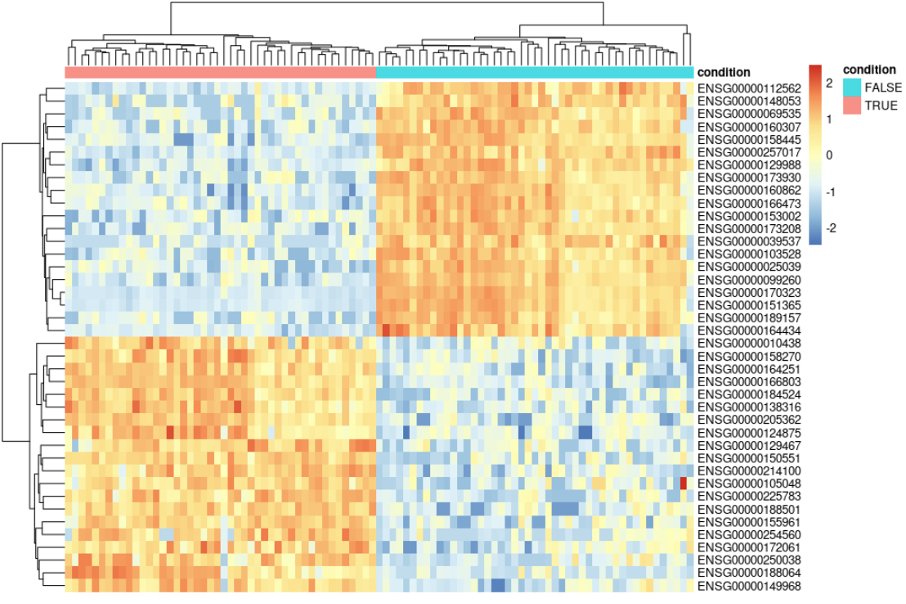
You can then go many other types of downstream analyses. One example is a simple heatmap with some top DE genes, or DE genes that are in your biological pathways of interest. Usually, the pheatmap package allows more versatility in plotting not only gene expression, but also other layers of metadata.
This will generate the following plot:
After that, the rest of the analysis consists of performing gene set enrichment, for e.g. using Gene Ontology terms, or KEGG pathways. This helps explaining the effect of the DE genes. Other possibilities are to focus on known genes and show that they are indeed differentially expressed. But this is mostly depending on the hypothesis that one is evaluating.
For more information about RNA-seq and BRB-seq data analysis do not hesitate to reach out at info@stratech.co.uk


